Revive Website Redesign
Rebuilding Revive's digital presence from the ground up, refining the visual identity, reworking the content strategy, and building the entire site in Webflow.
Client
byrevive.com
Role
Web Design, Visual Identity, Webflow Development
Collaboration
Brand Strategy Consultant
Timeframe
2026
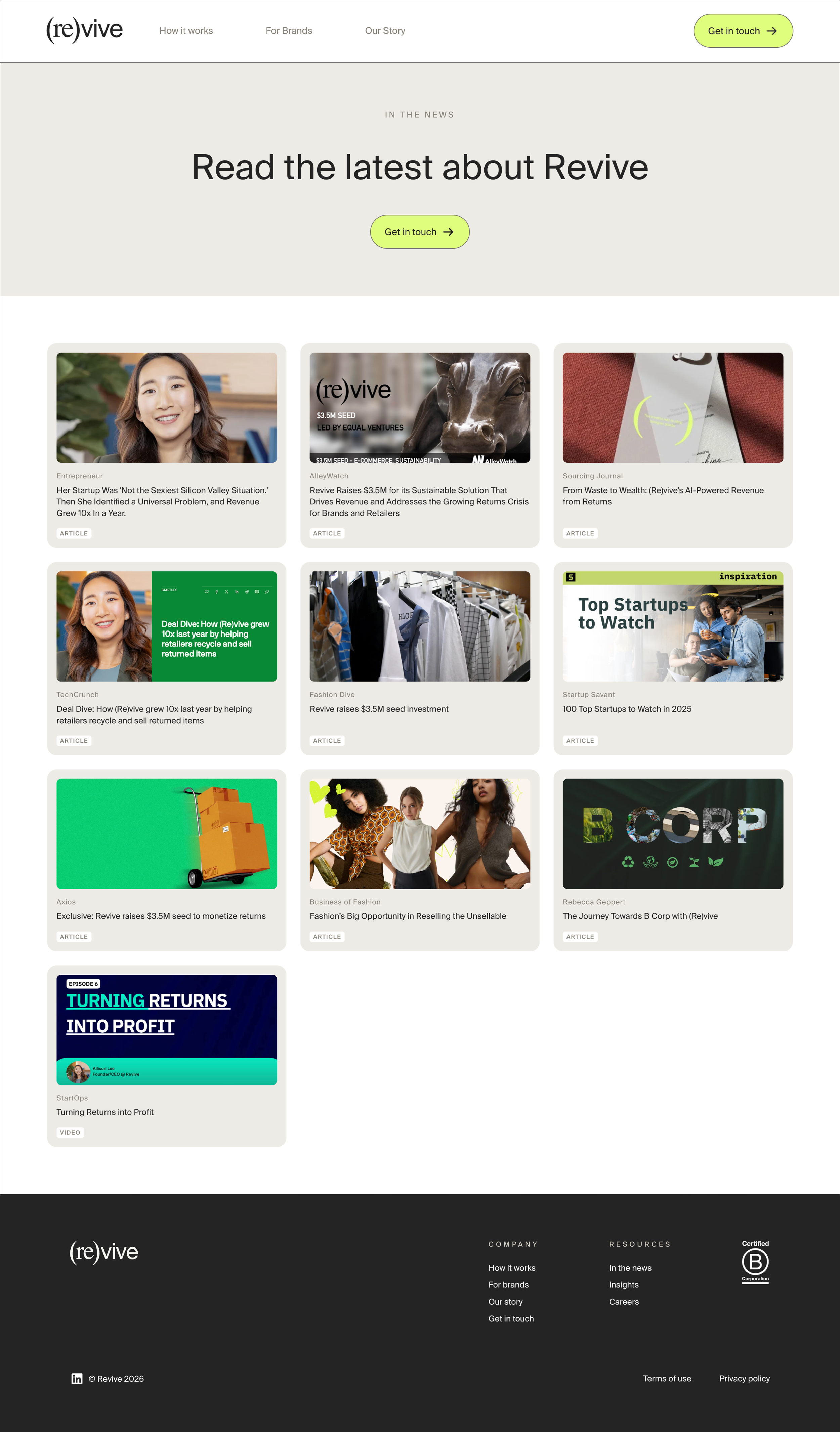
Revive is a platform connecting brands with top-tier resellers. They had a clear vision for who they were becoming, the existing site just wasn't communicating it. The previous design leaned heavily on flat vector illustrations that read as B2B tech, when the brand actually lives at the intersection of fashion, resale, and culture. The goal was to rebuild it into something that finally felt like them.
ProblemThe team's own words summed it up: the site felt too SaaS-y. But, beyond the visual direction, there were a number of structural issues to untangle:
Flat vector illustrations borrowed from the B2B/SaaS visual playbook, not the fashion-adjacent brand they were building
Color palette that had grown inconsistent and inaccessible over time
Two typefaces where one would do, and no clear typographic hierarchy
Inconsistent footers, one page had an entirely different footer than the rest of the site
Key content buried behind unnecessary page navigation
No photography yet, the company was still in early stages
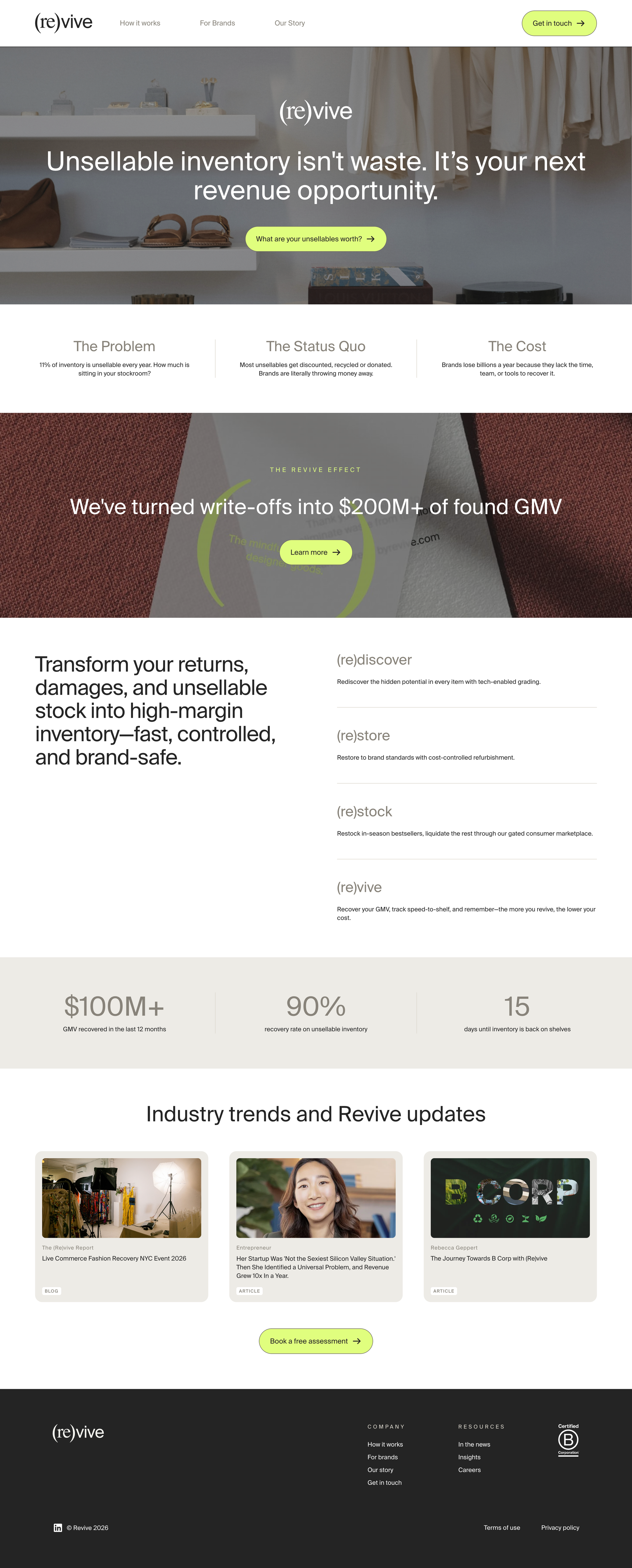
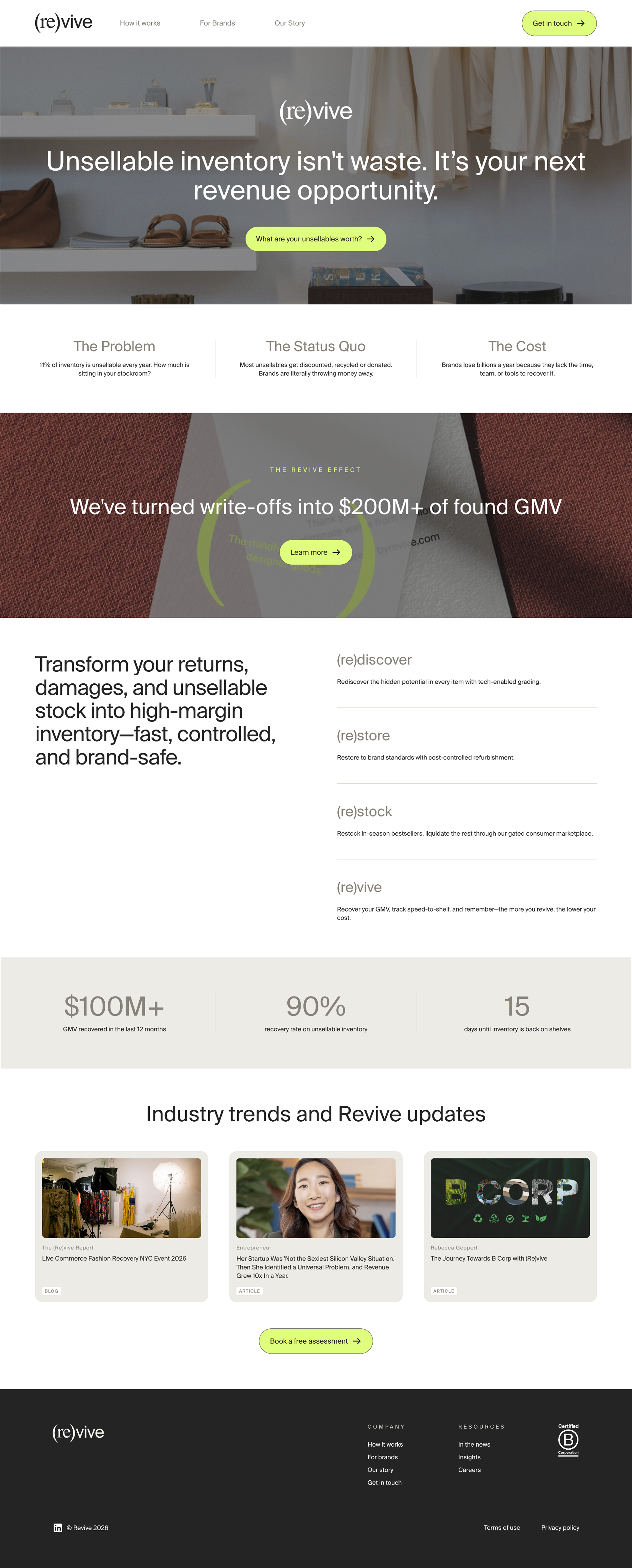
new homepageold homepagethe directionBefore touching any design, I started with a deep-dive questionnaire, understanding brand goals, audience, and what about the existing site wasn't working.
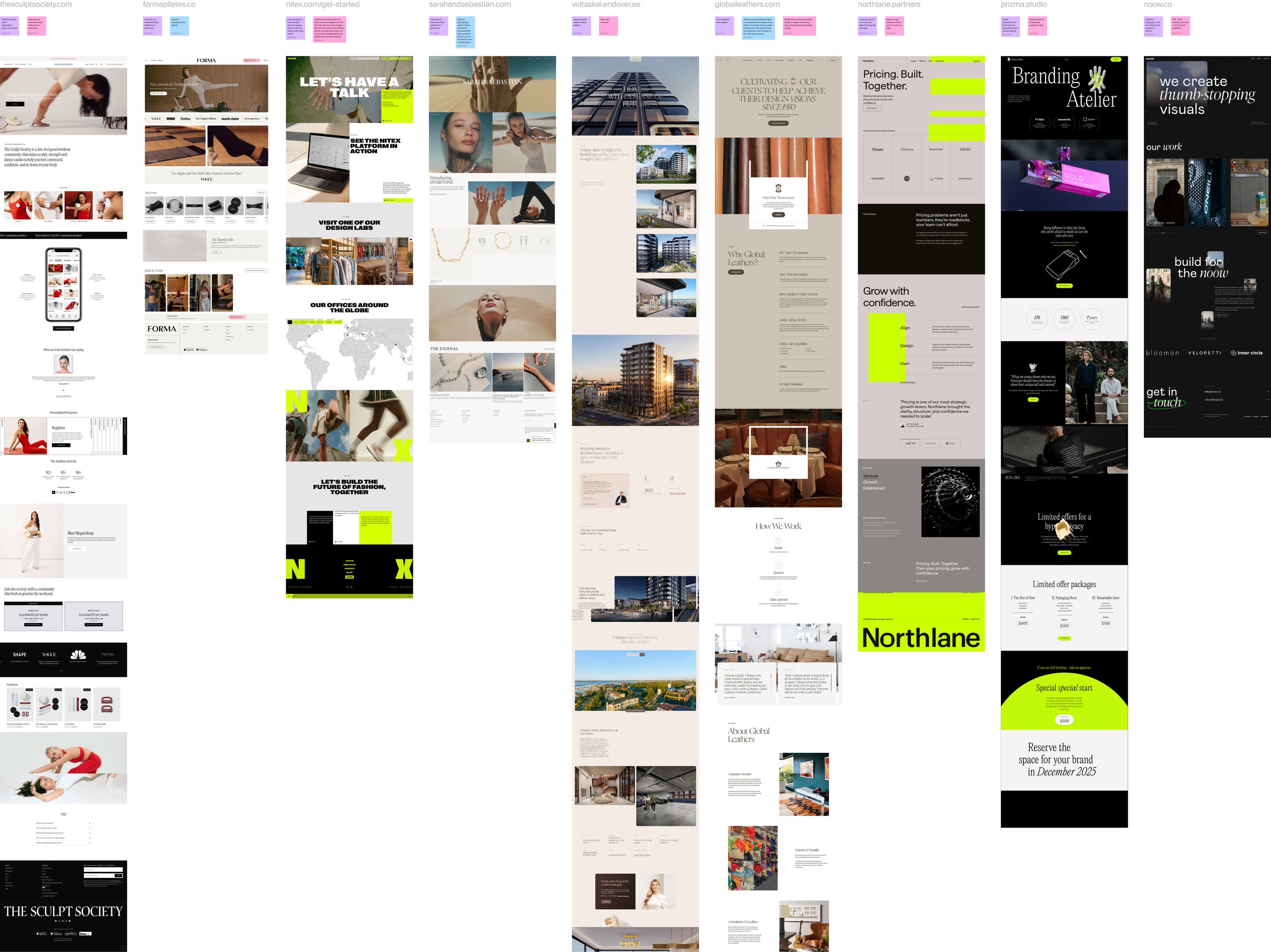
From there I built out several distinct moodboard directions, since Revive wasn't entirely sure what they were going for. Once the fashion editorial direction clicked, everything had a clear reference point. The visual grammar of luxury brand lookbooks and editorials, photography, whitespace, restraint, became the filter for every decision that followed.
visual identityRevive had brand elements worth keeping, the goal was to sharpen what was there, not start over.
old color palette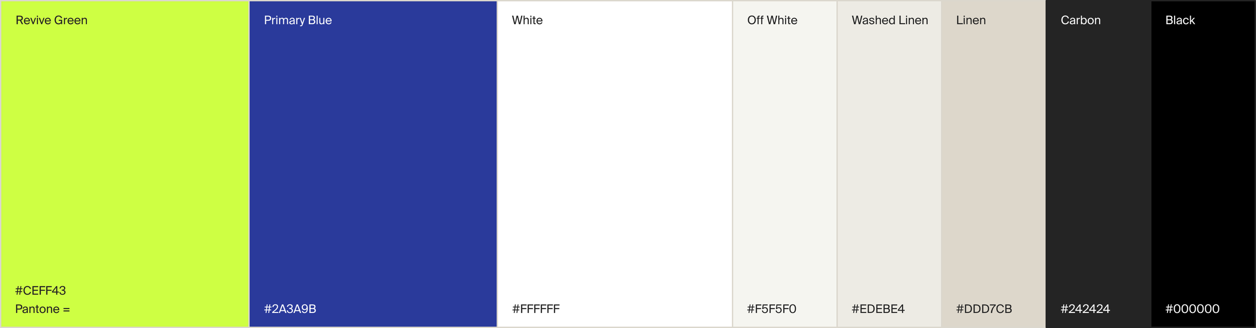
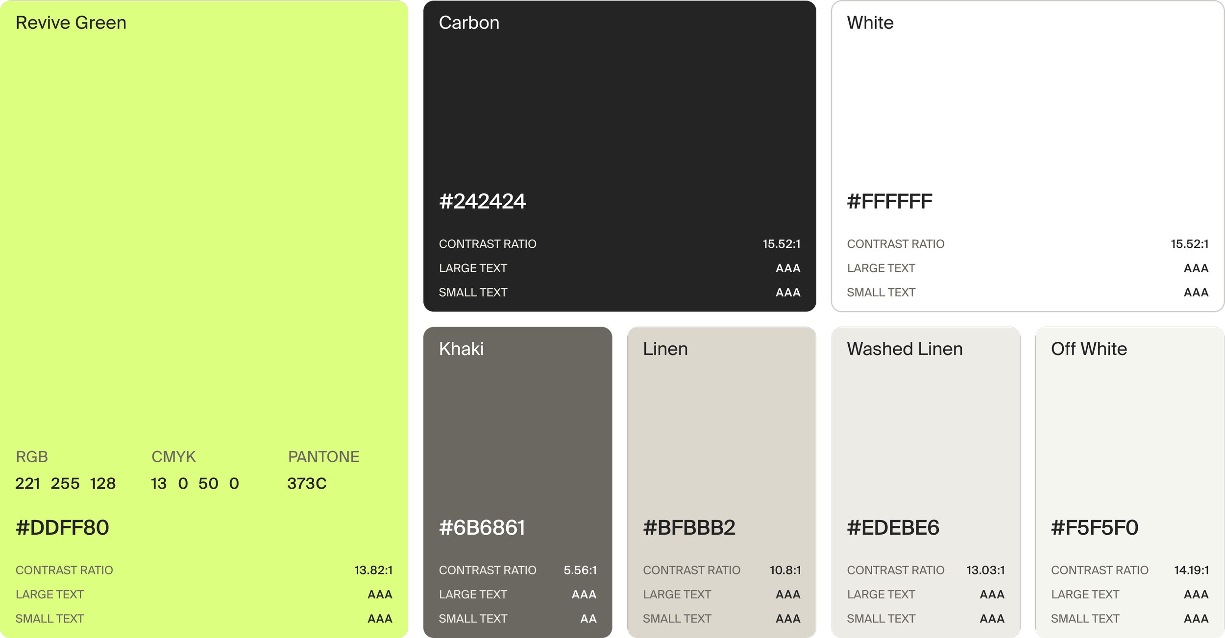
new color paletteRemoved two underperforming colors and updated a couple hex codes for better accessibility and cohesion.
Old typography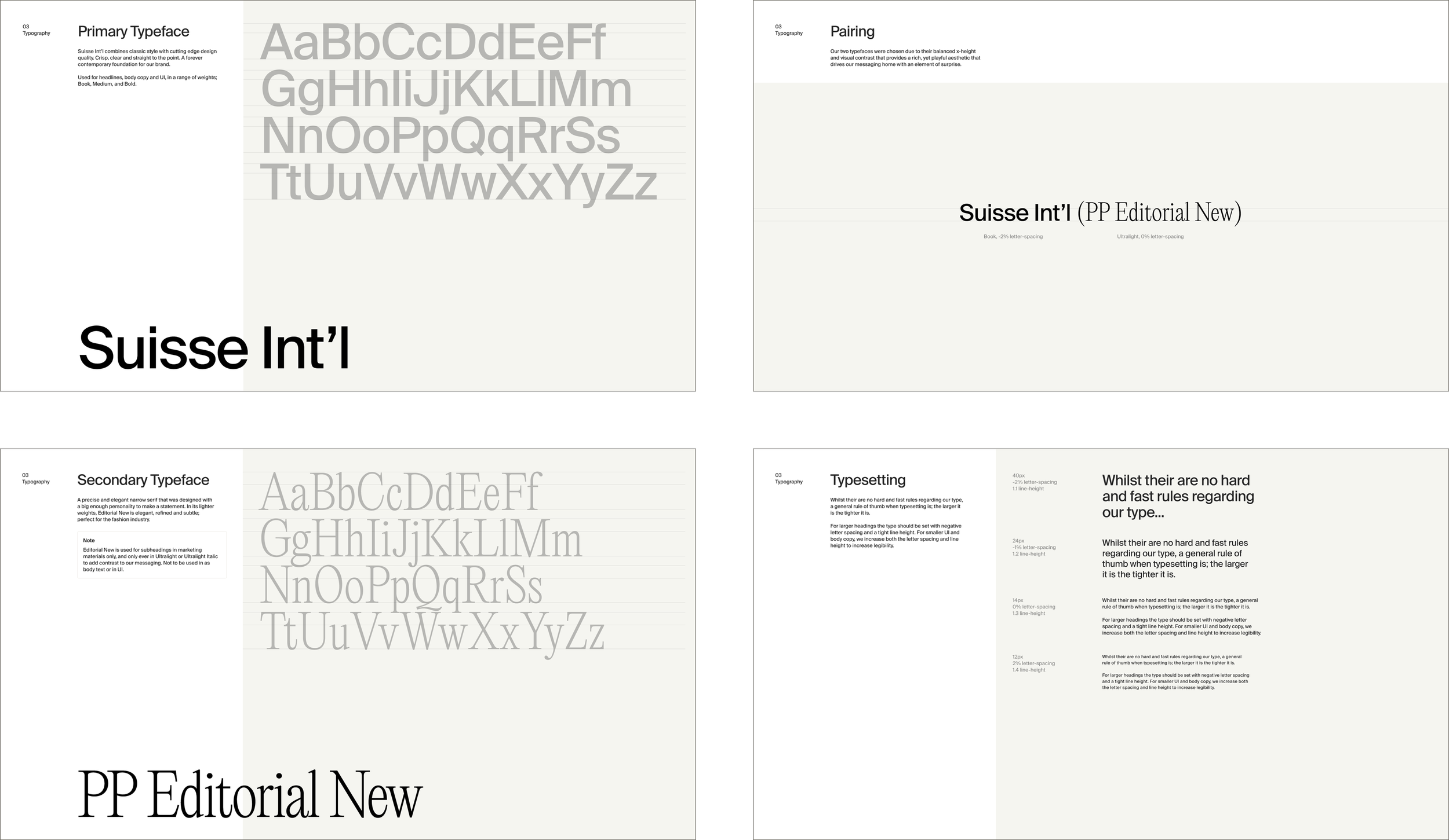
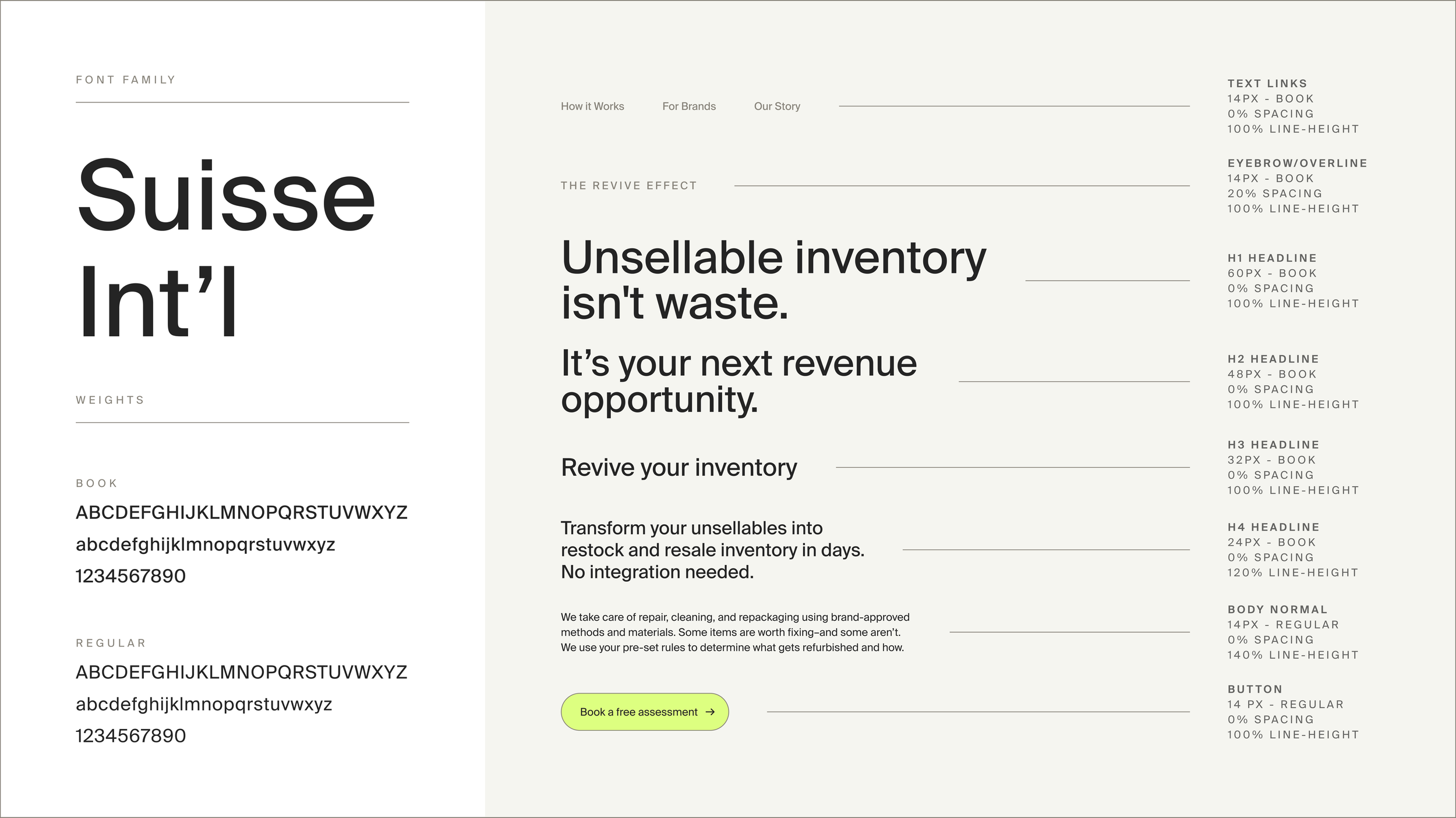
new typographyConsolidated from two typefaces down to one, the stronger of the two, and built a proper hierarchy from scratch. Legibility improved significantly, especially at smaller sizes.
The shift from startup dashboard to fashion forward site.
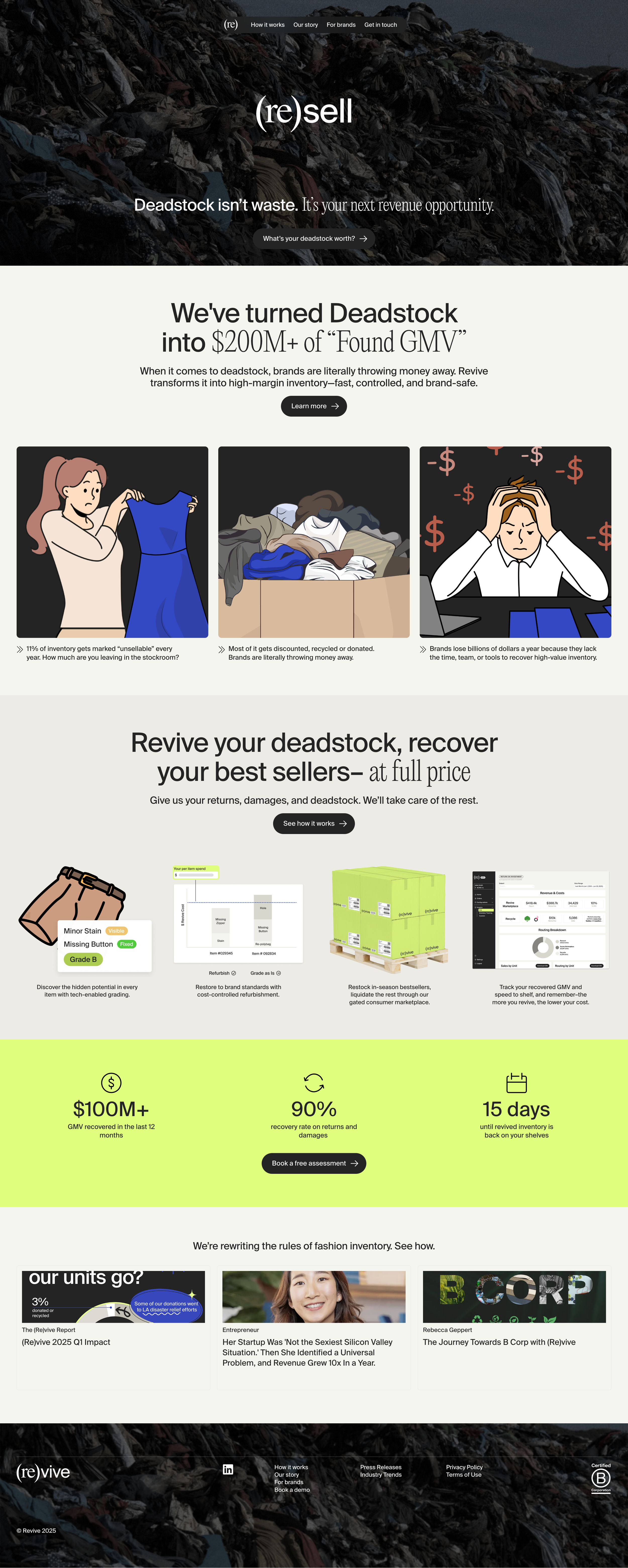
The flat vector illustrations on the previous site evoked B2B tech. They signaled functionality and process, which is right for a SaaS product, but wrong for a brand at the intersection of fashion and resale culture.
What I changed:
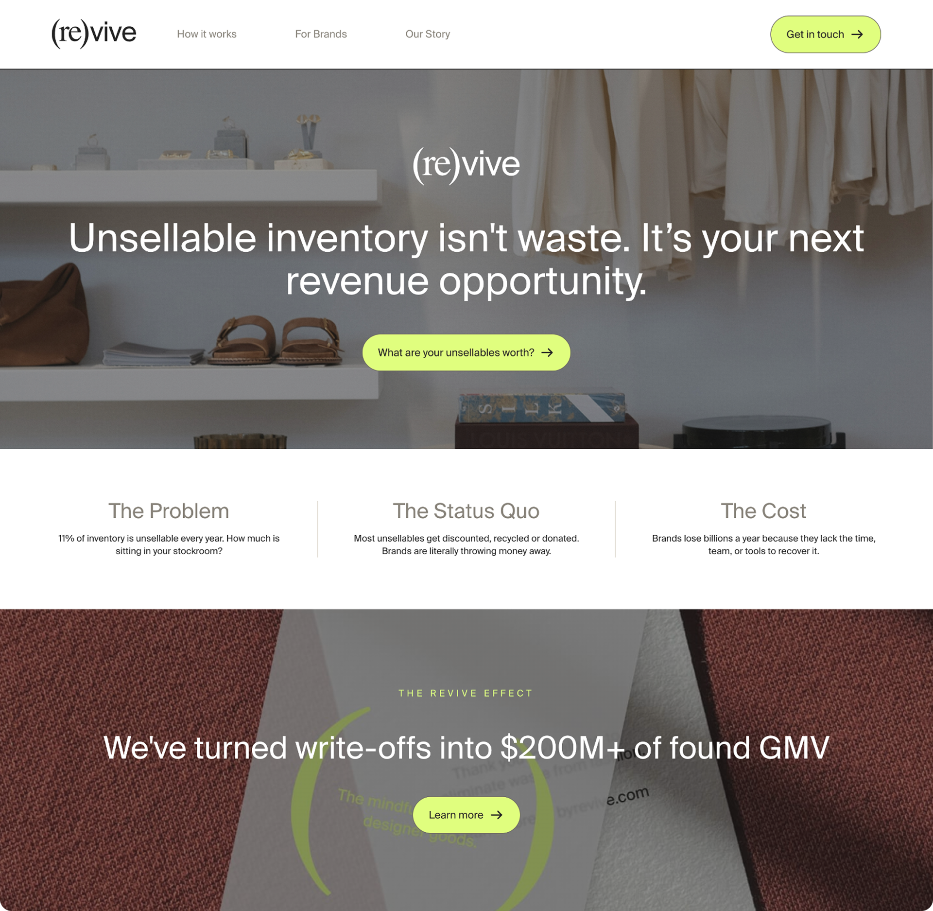
Illustrations out, curated stock photography in. I selected editorial photos with natural light and fashion-adjacent framing while Revive builds their own photo library.
Icon library rebuilt based on the Ming Cute library so that they can always have access to new icons should they need them.
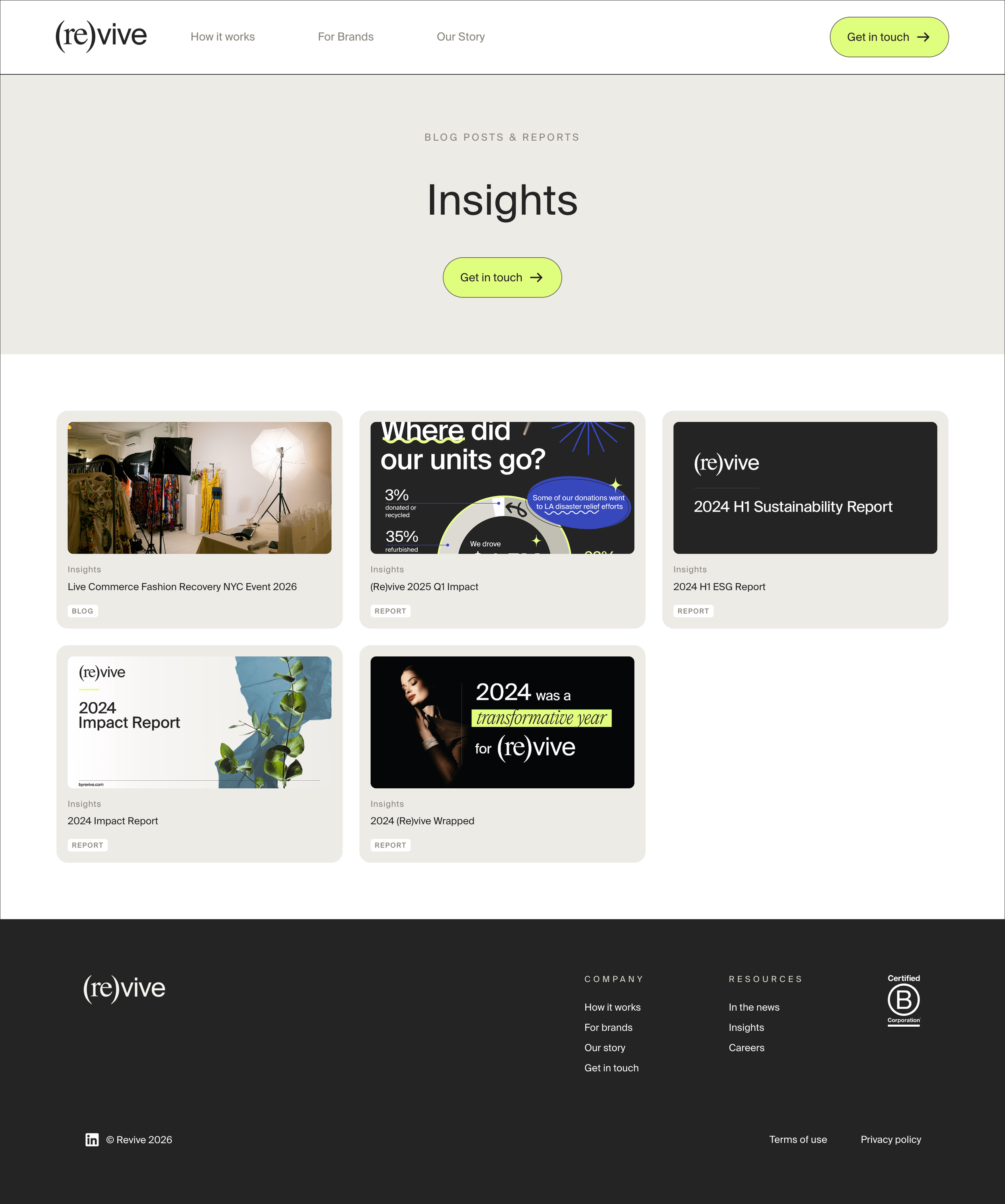
New button styles and card designs that borrow from magazine layouts
New media-type badges on cards to categorize content (article, video, etc.)
Old graphics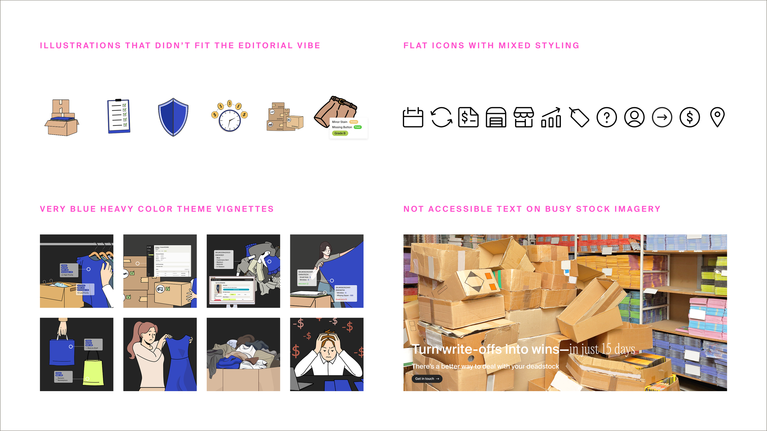
New graphics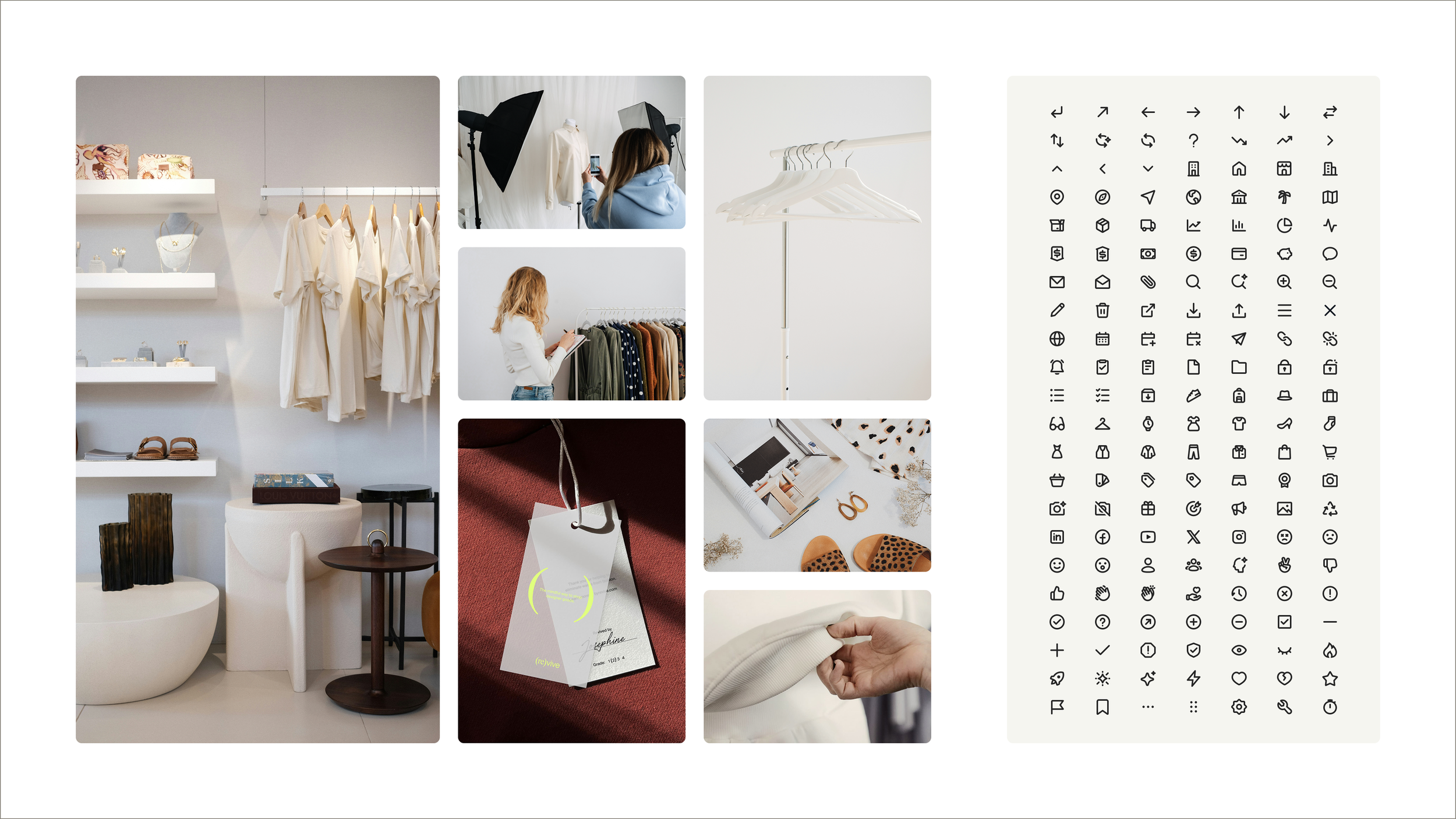
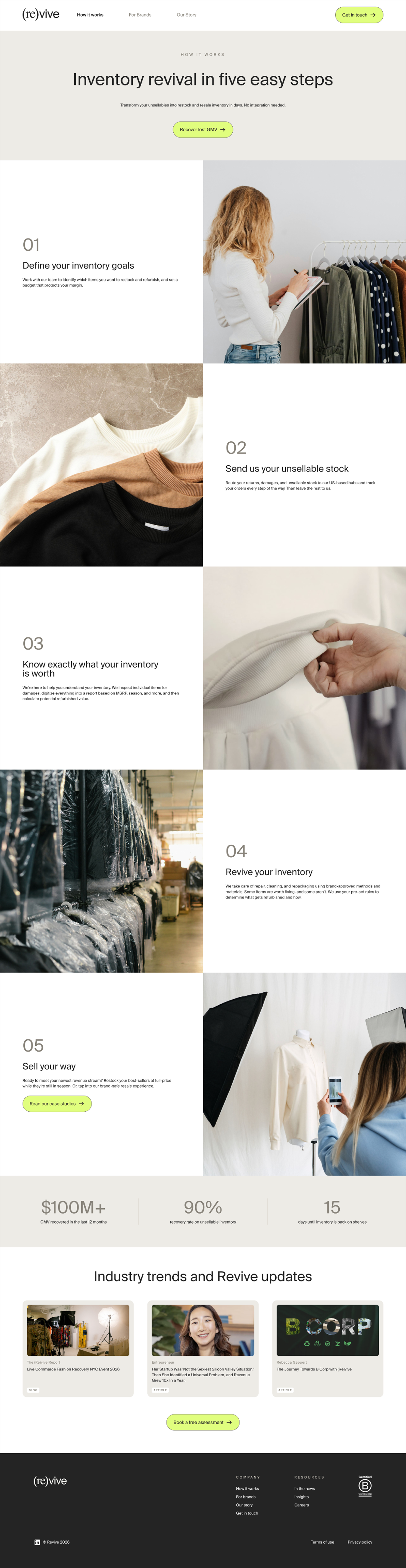
the processEvery page was stripped to just content first, no styling, no layout, and worked through with a brand strategy consultant. Some content was cut, some reframed, some rewritten.
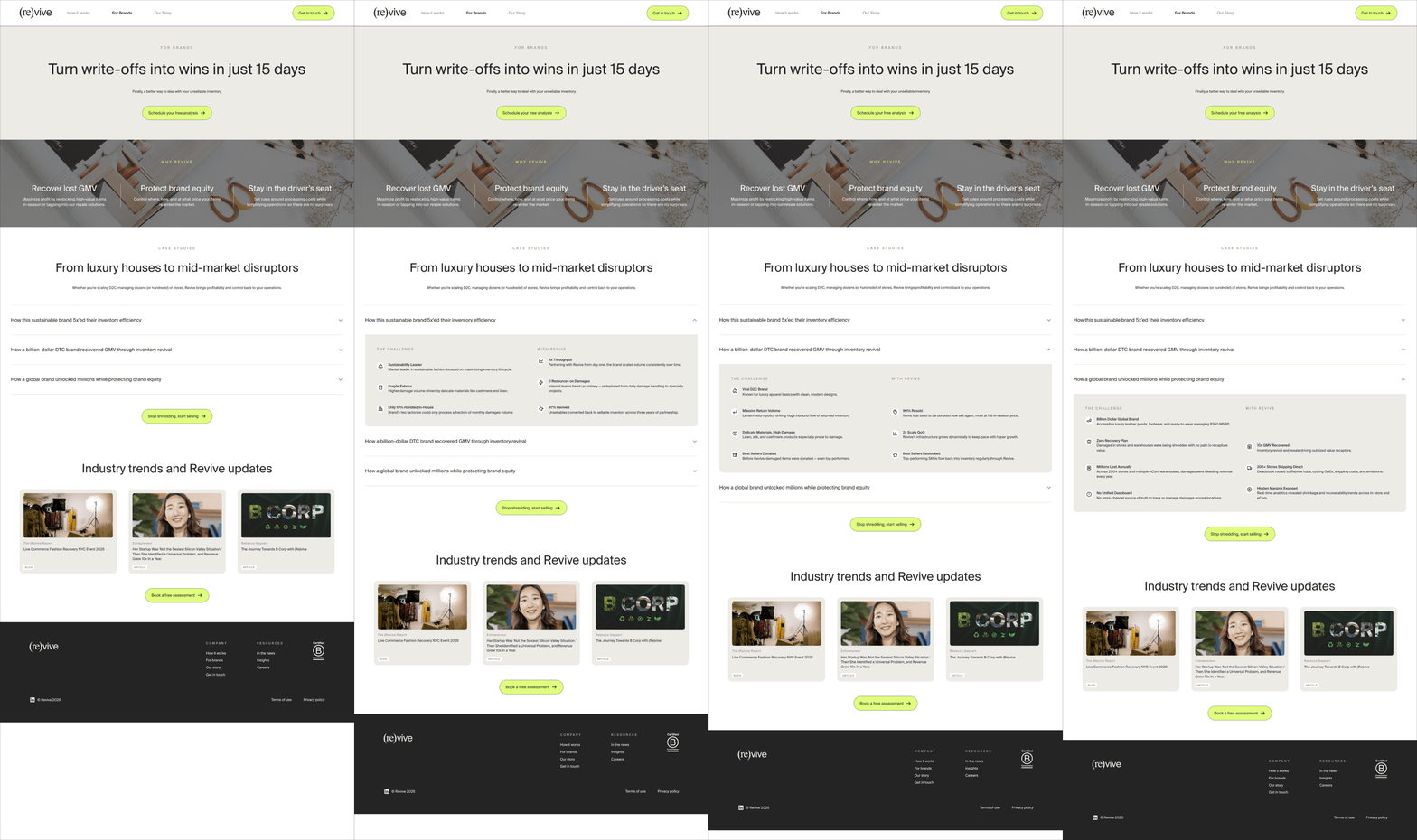
For Brands page: previously surfaced all case study content at once, which was overwhelming. Redesigned with a drawer-based structure so users can engage with each case study at their own pace.
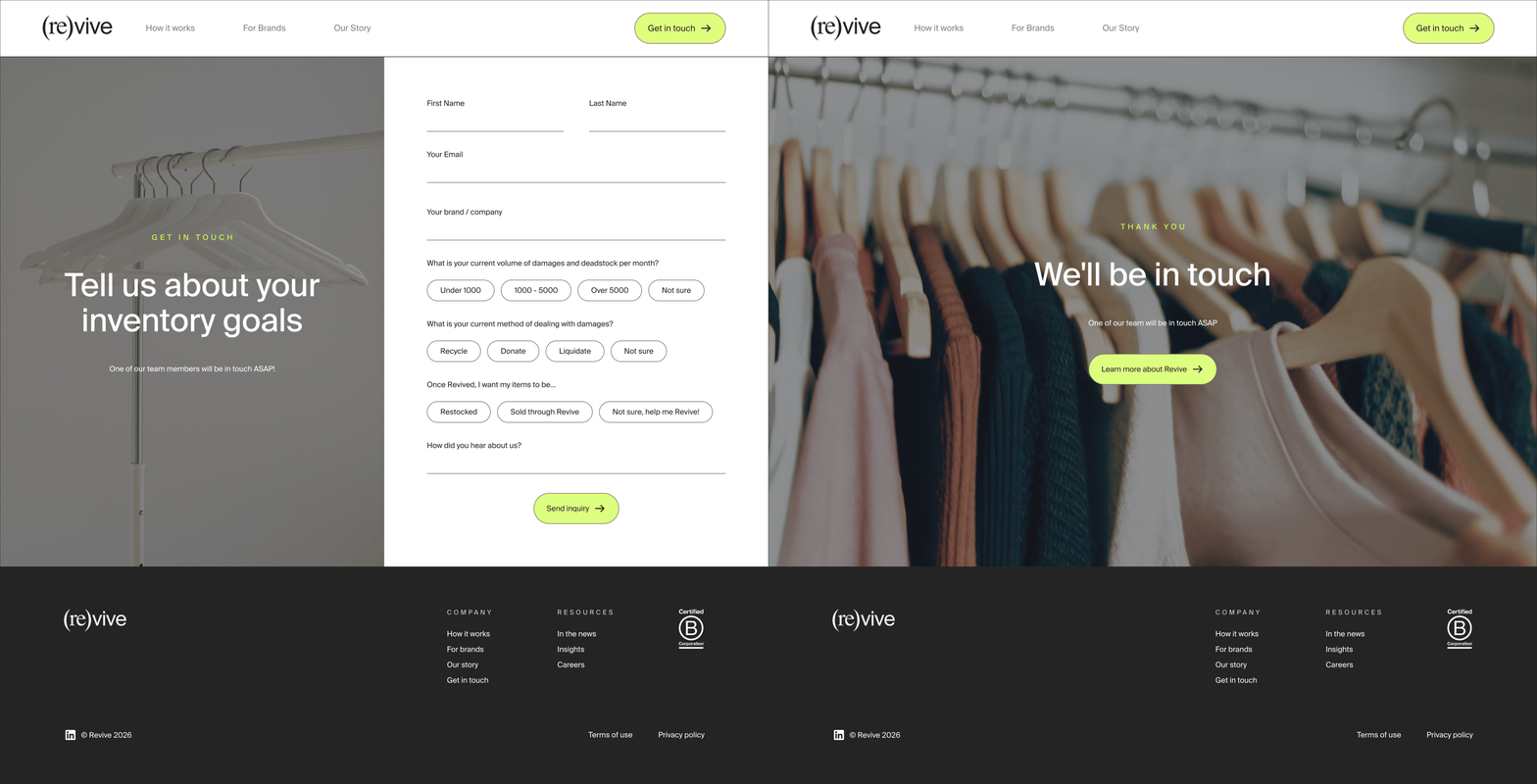
Footer consistency: one page had an entirely different footer than the rest of the site. I unified it across all pages.
Our Story page: added micro animations to the inventory logos section to add warmth and life.
Accessibility: treated as a design constraint throughout, contrast ratios checked at every step, hierarchy built for legibility.
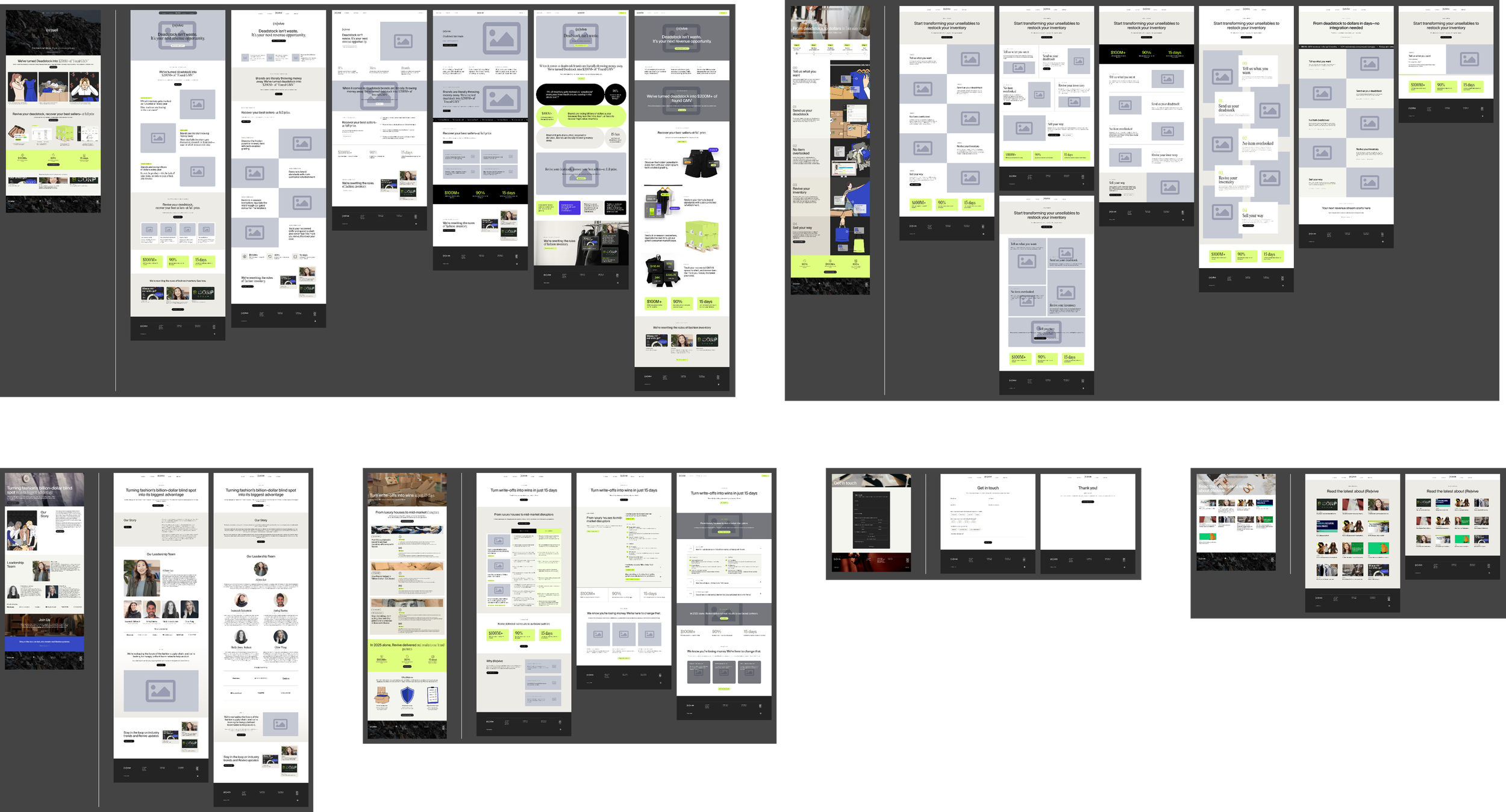
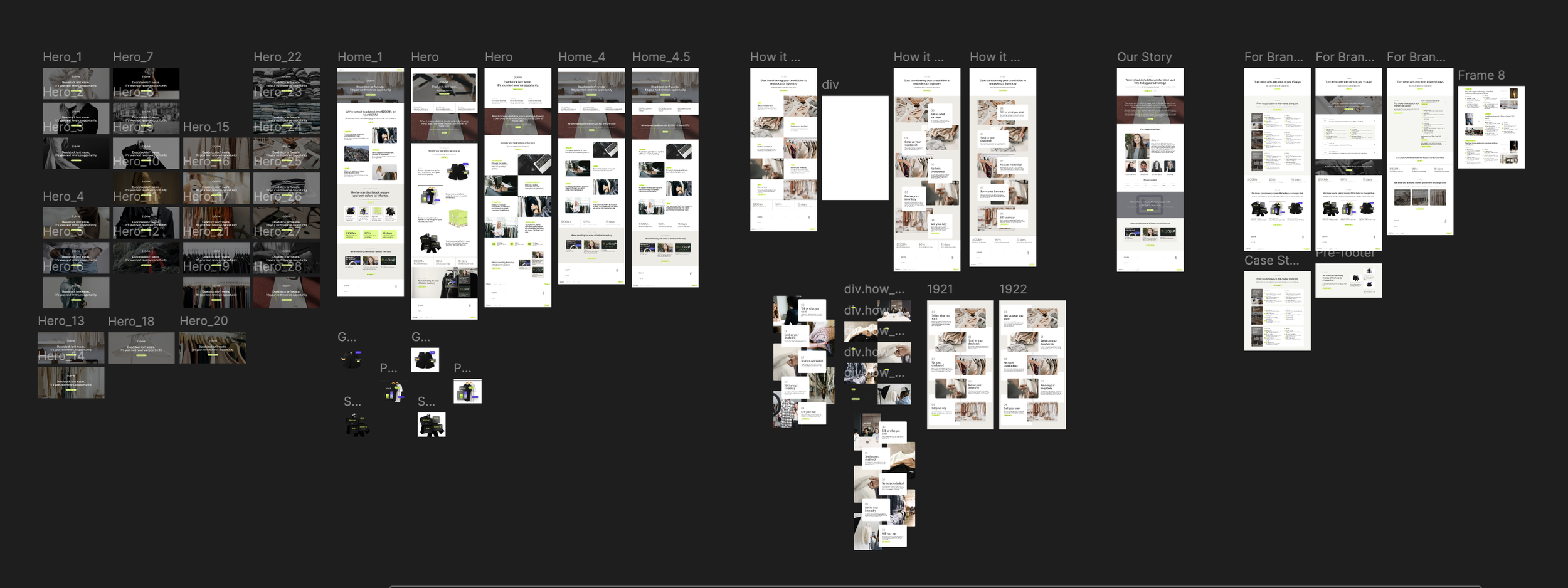
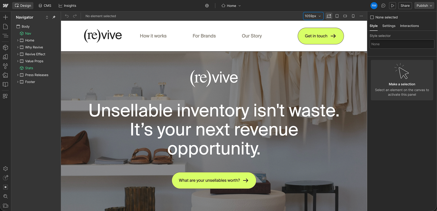
the buildBuilt by me, in Webflow, from scratch.
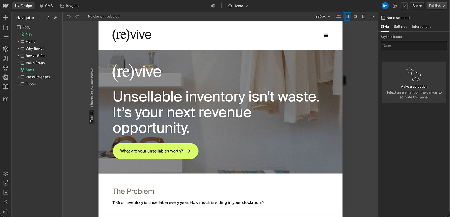
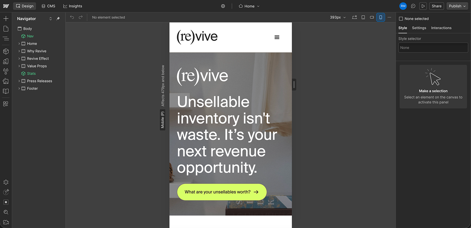
The entire site was built by me, every page, every component, every interaction. No templates. Desktop, tablet, and mobile breakpoints were treated as distinct design problems, not afterthought adaptations.
THE RESULTSA site that finally sounds like them
Fashion editorial visual language replaced the tech-leaning illustration style, aligned with where the brand is headed
Refined, accessible palette with two colors removed and updated hex codes across the system
Unified typography consolidated to one typeface with a clear, legible hierarchy
Cleaner content architecture across all pages, developed with a brand strategy consultant
Fully responsive, desktop, tablet, and mobile built and implemented in Webflow
Improved accessibility across contrast, hierarchy, and navigation
New component system, buttons, cards, badges, icon library, ready to scale
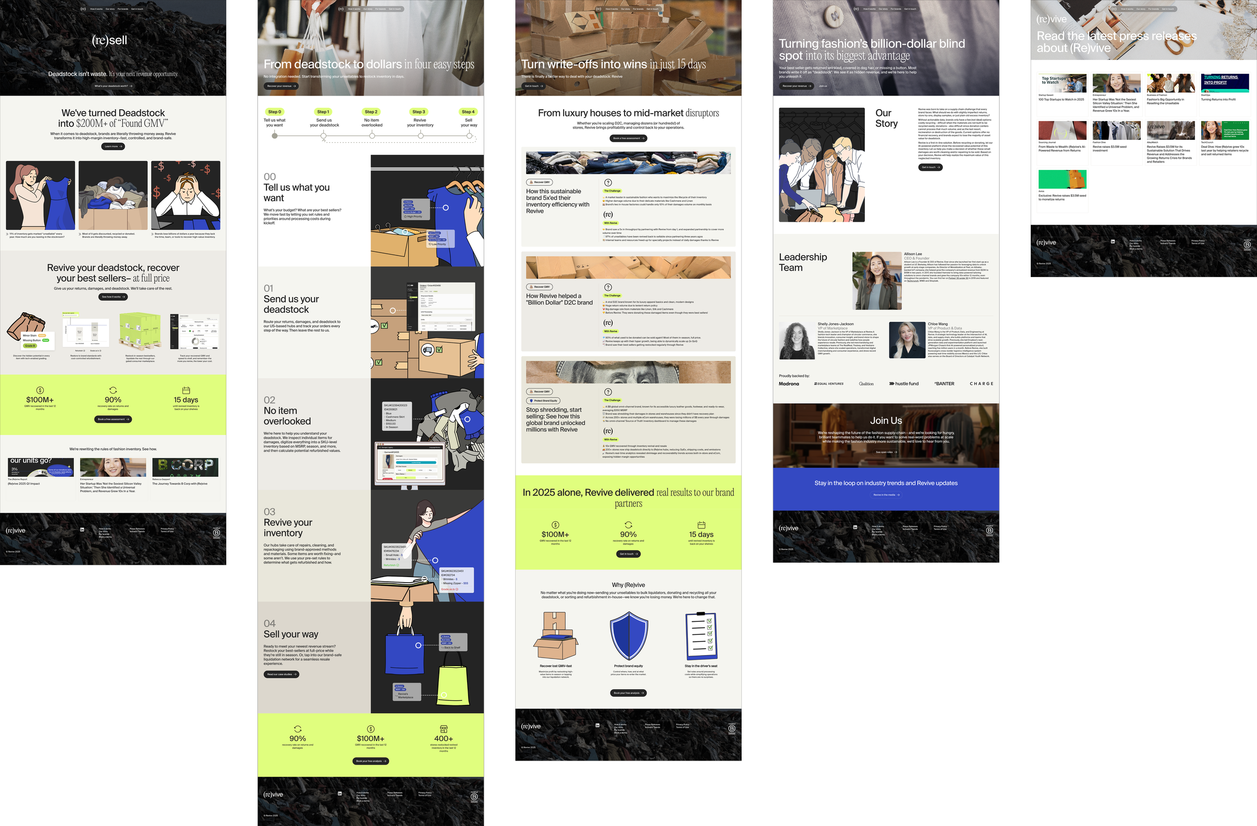
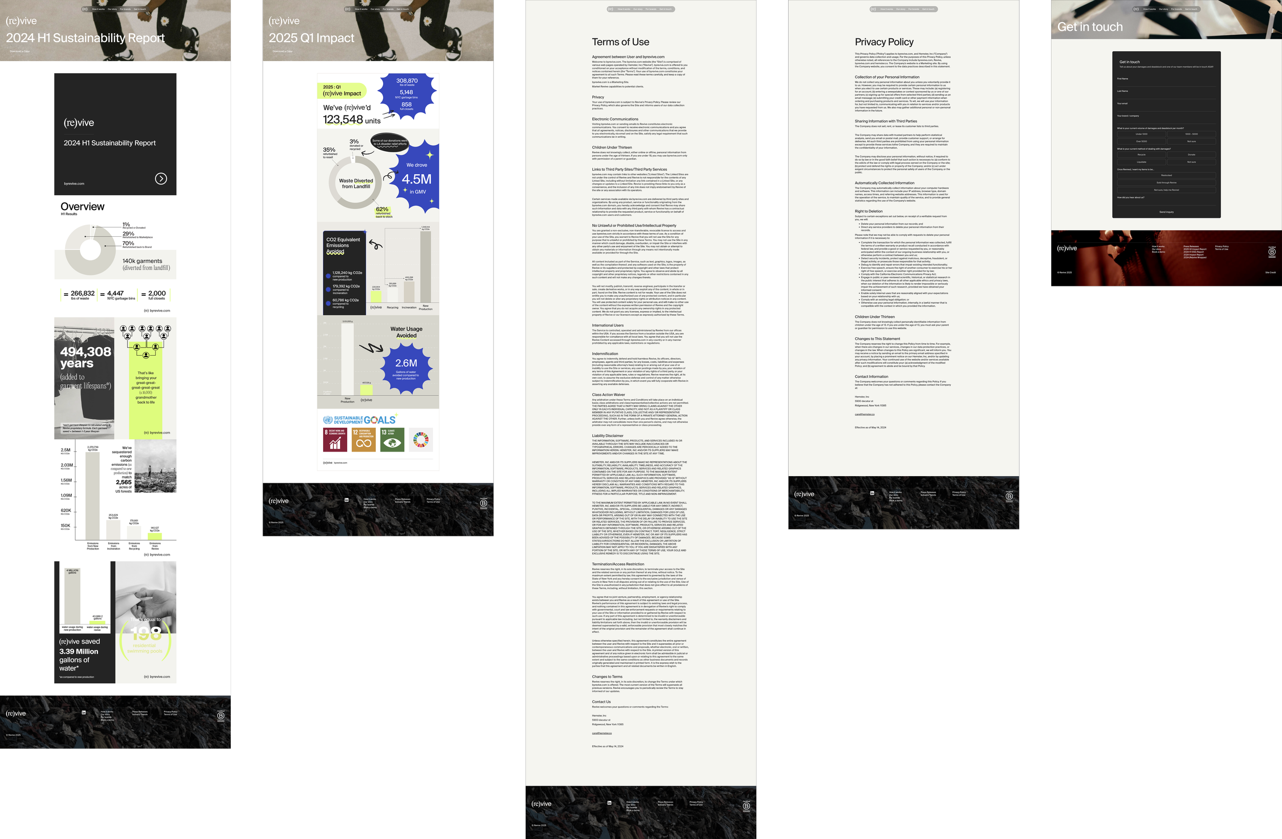
The Befores
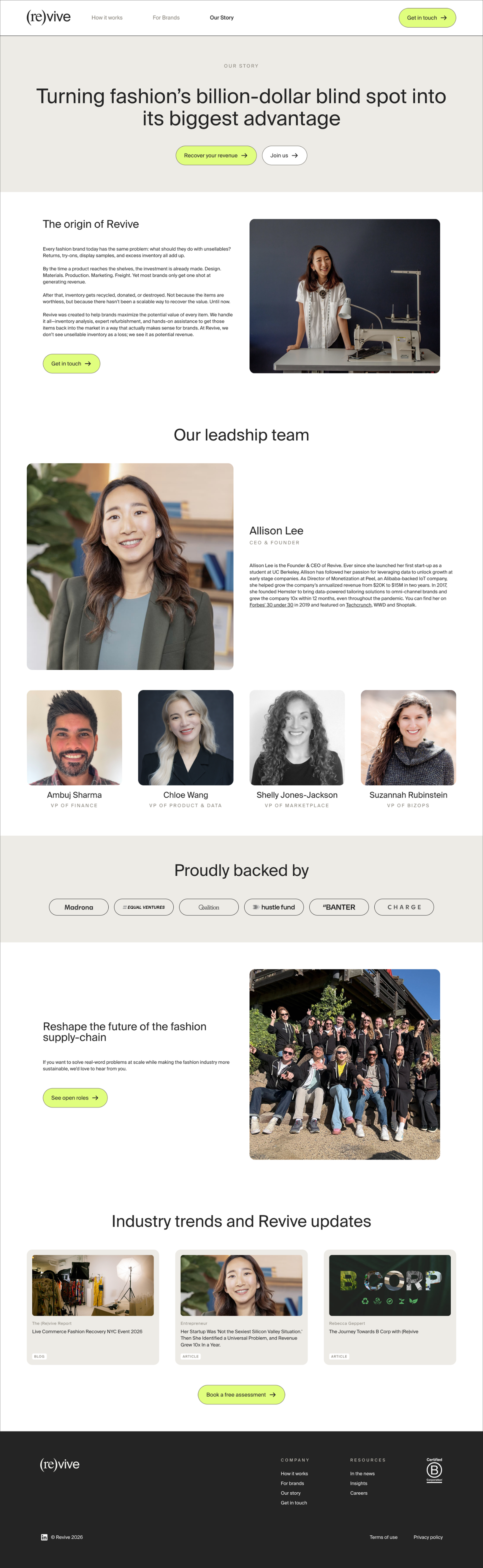
The Afters
Visit the live site here.