

Public Menu
My Role
Product Designer
Strategic vision/thinking
UX research
Team
1 Designer
2 Product Managers
Timeline
Q4 2020 - Q3 2021
Background
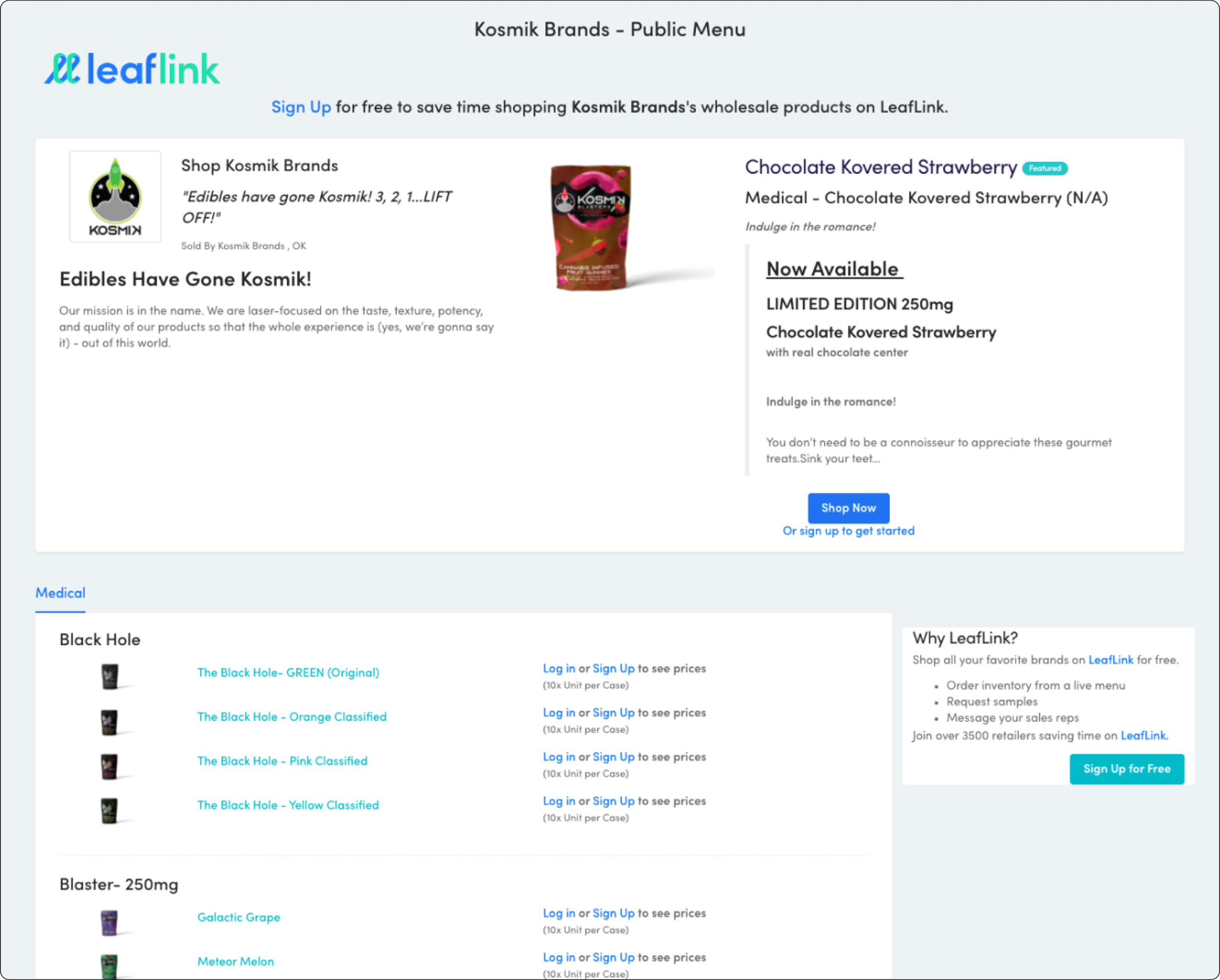
Leaflink is the cannabis industry’s preferred wholesale ordering platform. On the logged-in experience there exist brand menus that list all relevant information about a brand including products, pricing, etc.
The Public Menu is a non-gated version of this page used as a lead-gen tool for both the LeafLink team as well as prospective cannabis retailers.
It was originally launched in Oct 2017 and needed a heavy UX/UI lift.
Problem
The Public Menu was originally launched in Oct 2017. It is a highly visible, and utilized page for both brands and LeafLink, but is an outdated resource and has since seen very few functional or visual updates.
Goals
Update the look and feel while modernizing the components used
Increase its usefulness for brands to showcase their products and company information
Increase the value prop for retailers who aren’t already using LeafLink
Current Problems
Overall
Not a clear representation of the partnership between the brand and LeafLink
Doesn’t show compelling information about LeafLink or it’s offerings to unfamiliar visitors
Disjointed path for main CTAs
Design-wise
Using extremely old code/design elements
No hierarchy of information
The text & images are too small
Text-focused over product/image focused
Sections are all over the place
Where it’s used
Internally: Emails / Landing pages
Promos & Email blasts
Annual awards site
Externally: to brands
Sales rep emails
Native brand’s websites
Research
Internal stakeholders
Who is the audience?
What should users do on this page?
What info should be available on this page?
What’s working vs not working
LeafLink brands & retailers
What differentiates the Public Menu from the in-app menu?
What segment of users they are directing to this page/why?
What info they aren’t comfortable sharing on this page?
What elements of their brand are important to highlight?
What we learned
Overall interest in this feature was low due to the page’s lack of functionality and visual interest. This meant there was a low friction to make changes, but a high chance of success!
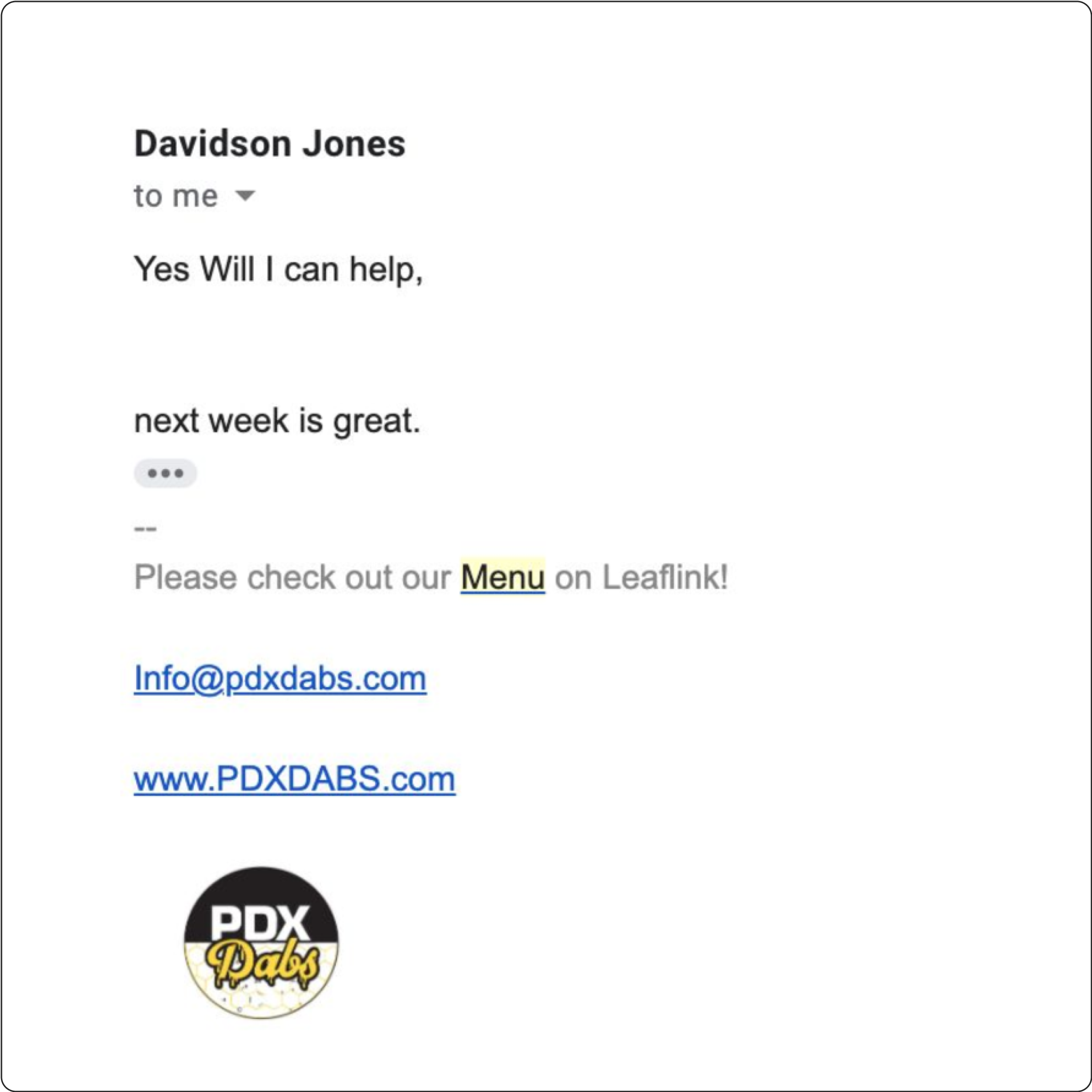
Sellers provide links to their public menus via email signature or their website to fast-track the LeafLink ordering experience
High friction flow for logged-out users to sign in and navigate back to the in-app menu
Marketing links to Public Menu to incentivize retailer signups, but value prop could be stronger
Existing, logged-in LeafLink retailers rarely visit it (least friction, least utilization)
Existing, logged-out LeafLink retailers sometimes use it (higher friction, medium utilization)
Non-LeafLink retailers use it the most (highest friction, highest utilization & biggest opportunity)
What we kept
Prices omitted
Wholesale pricing is nuanced and reliant on too many variables to display outright
High level of product accuracy (Includes featured products and a live view of available & back-ordered products)
Promotion of LeafLink
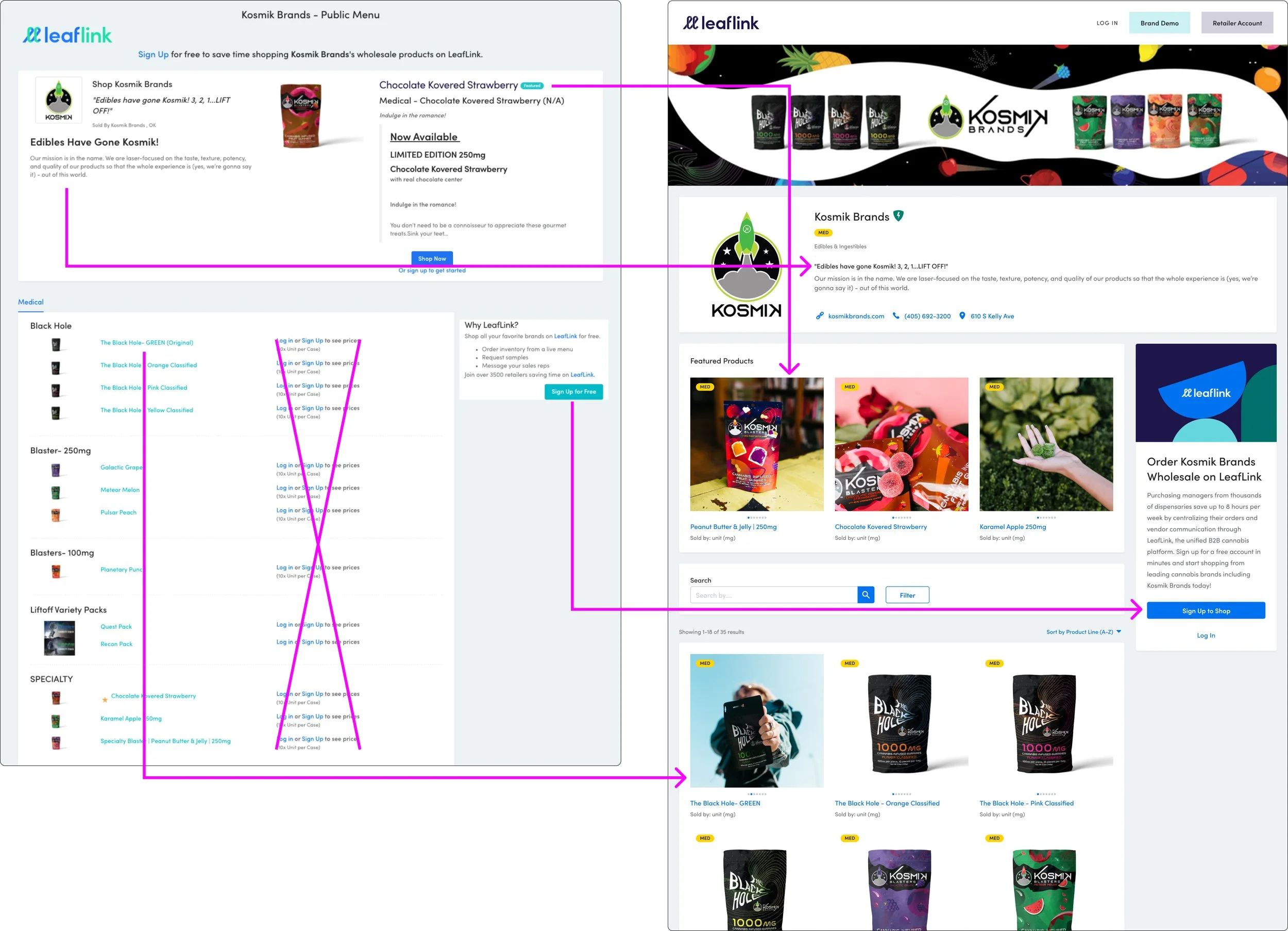
What we added
More compelling CTAs and information about LeafLink to drive acquisition
Increased visibility of brand elements: banner, logo, product images, and Certified Seller status
Less text, more image/product focused + new featured product section
Redirection for logged-out users directly to the in-app menu when signing in. All non-logged-in users see the public menu. Logged-in users will be taken to one of the following:
If the user has multiple licenses, they will be taken to the “License Selector” page
If the user can purchase from the brand, they will be redirected to the brand's internal menu
If the user cannot see the menu and does not have multiple licenses, they will be redirected to the general shop brands page
If none of the above applies, they will be redirected to their dashboard
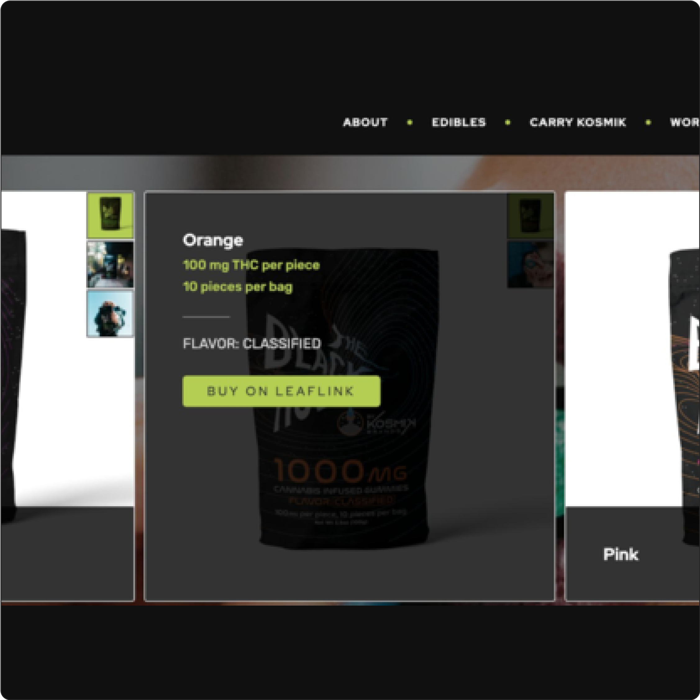
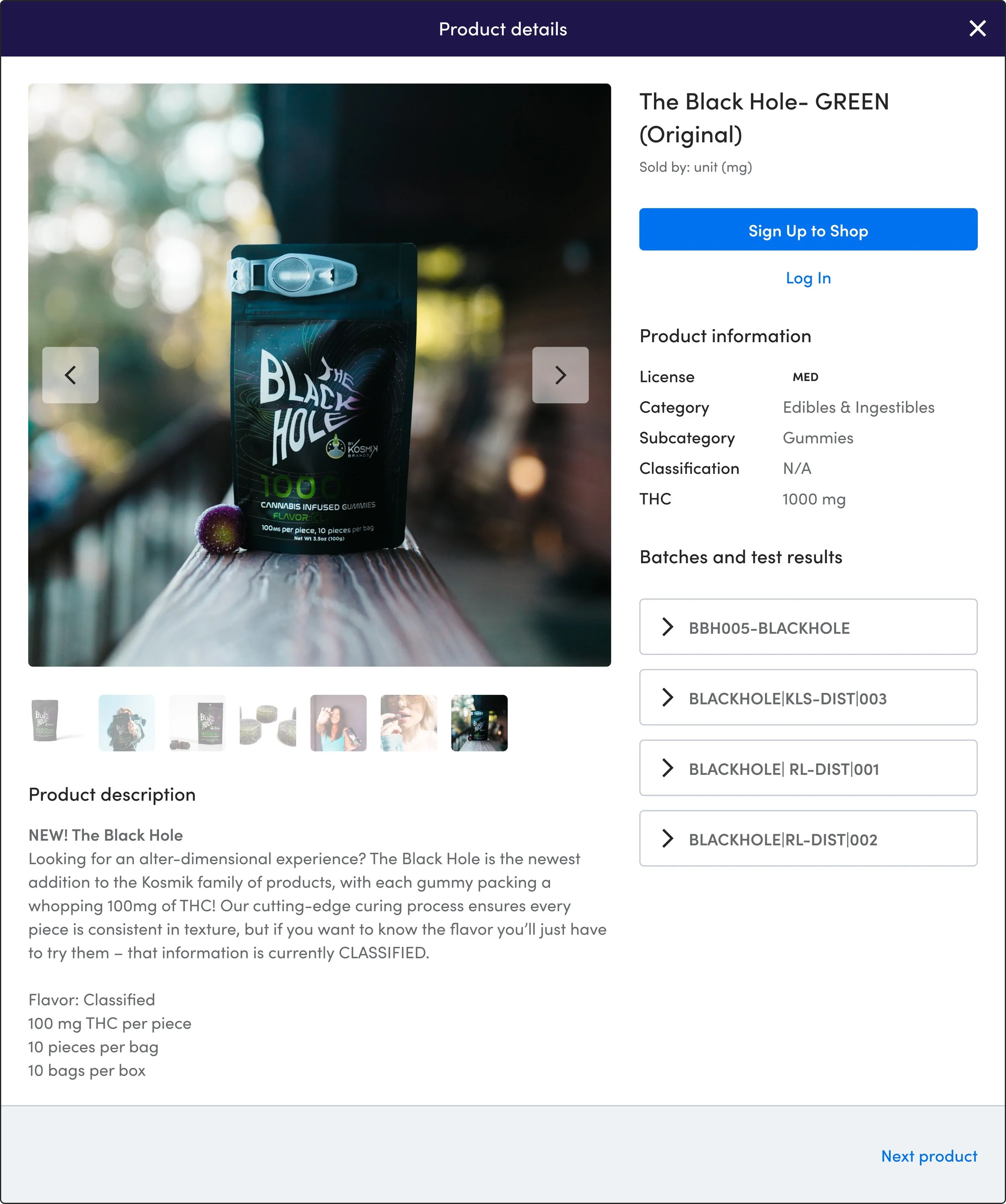
PDP Modal
Old experience hid product information behind a drawer with low-level product details
New experience brings in our in-app product detail modal which features:
Large imagery
Detailed product descriptions
CTAs to prompt the user to either sign-up or login
High-level product information, including batches and test results (THC & cannabinoid content)
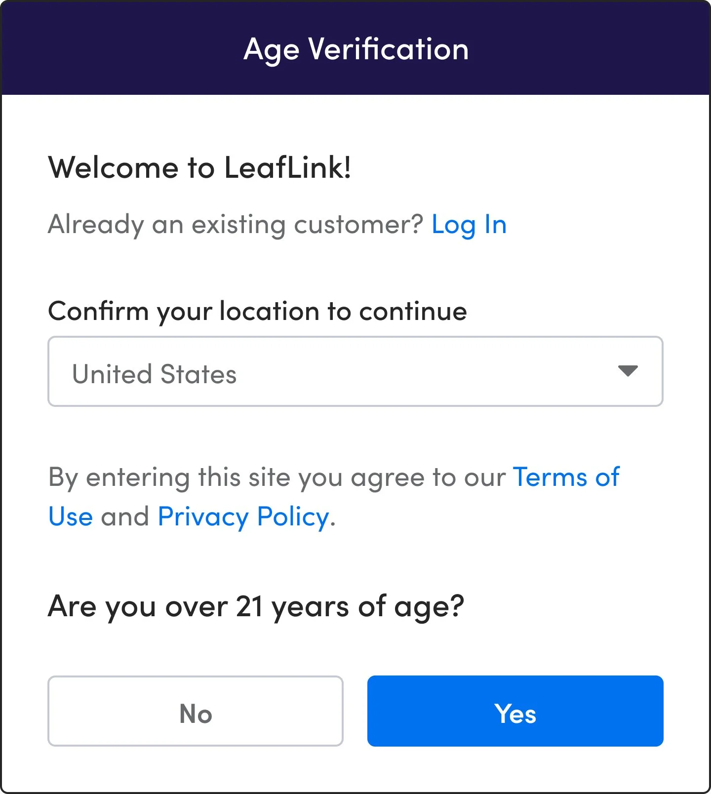
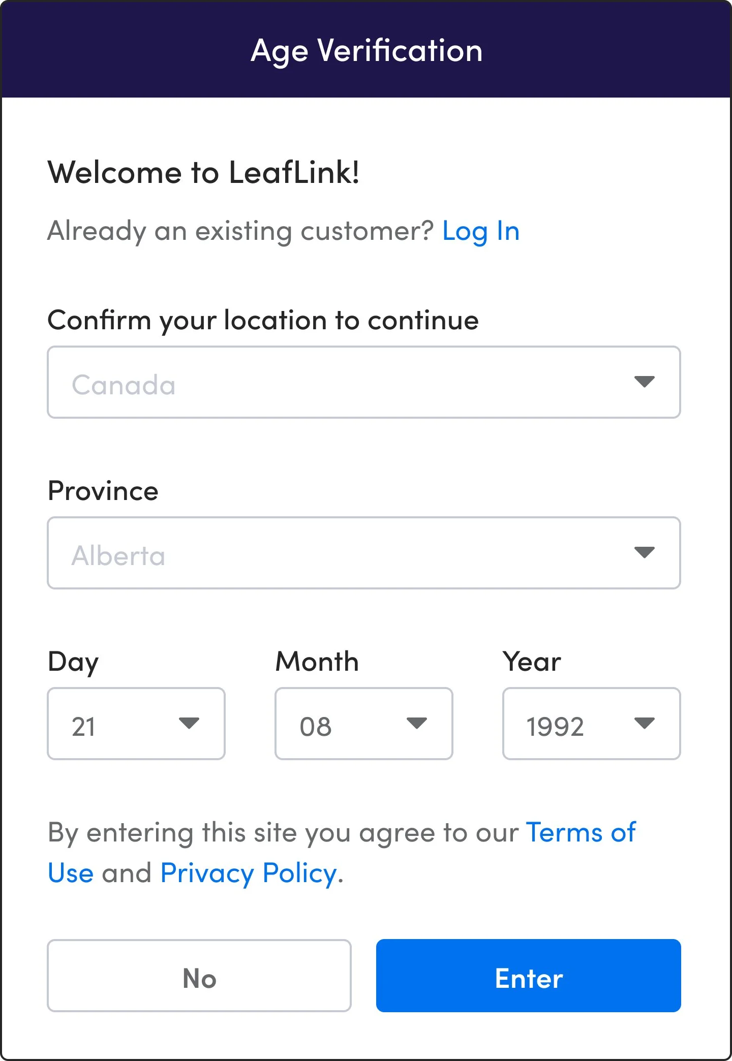
Age Verification Modals
Old experience had a low level of verification accuracy: One prompt, and two CTAs (Exit, Enter).
The new modal is more specific and introduces the ability to log in for existing users who land on this page.
The Canadian market is also accounted for as they have stricter legal rules regarding age verification.
PROTOTYPE
Select your location first to move through the flow.